SDK: The Skipify Button
Place the Skipify button before your checkout form to give consumers a faster, more streamlined payment experience
Overview
The Skipify button is one of the entry points for consumers to be able to pay with Skipify. This button allows customers who are not enrolled with Skipify to both enroll and pay directly within the same flow. Customers who are already enrolled can enjoy the beset checkout experience by circumventing the need to complete form fields.
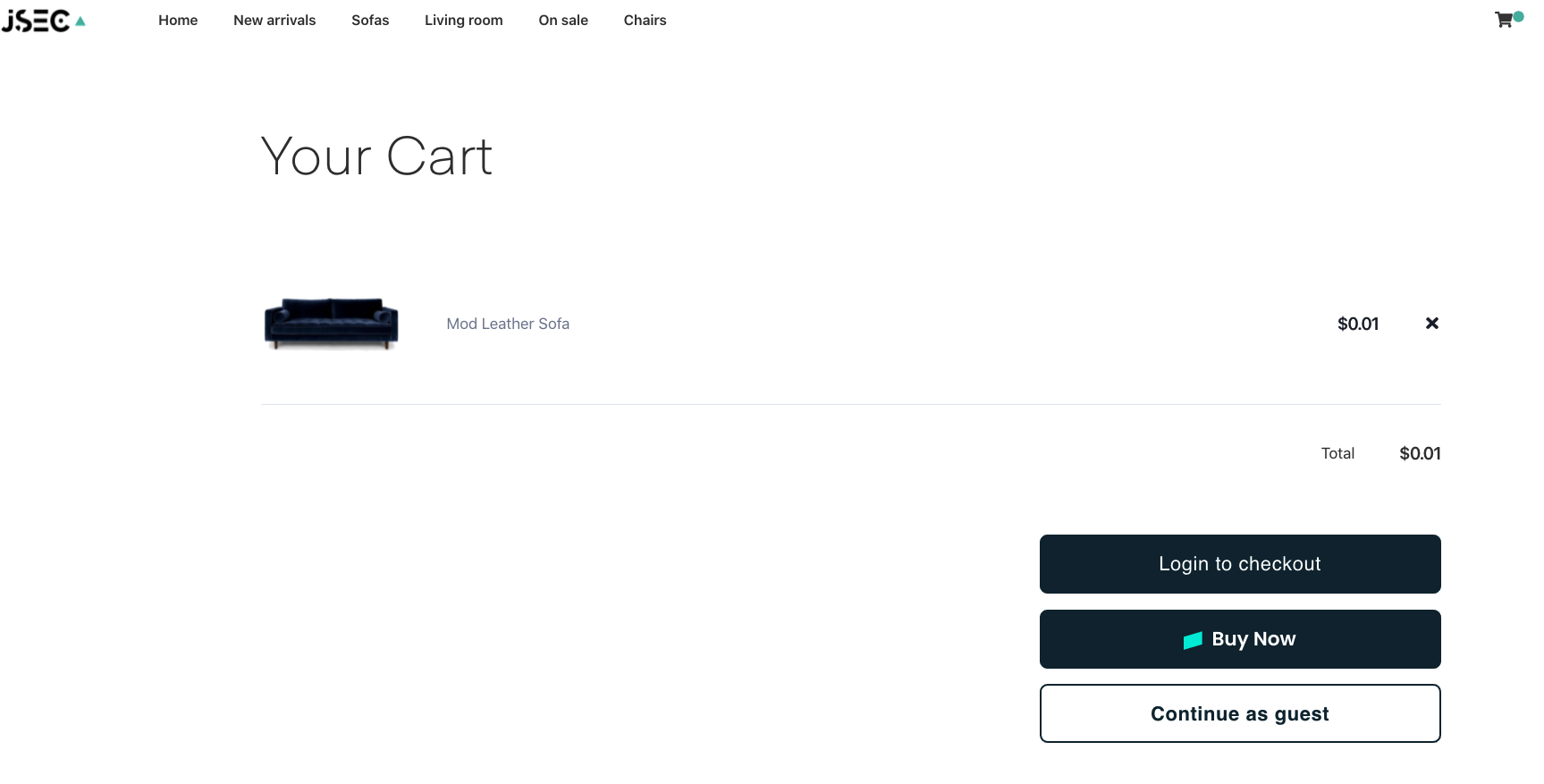
Here's an example of where you can add the Skipify Button

Initialize Order & Render the Button
Using a script tag, initialize the Skipify Button and the callback functions. The button can be rendered on your webpage with a call to the render function. You will need to provide a container for the button and assign it a unique id:
<body>
    // Place the SDK script at the end of your <body> declaration
    <script src="https://api-staging.skipify.com/merchants/MERCHANT_ID/sdk">
        // Replace MERCHANT_ID with your GoCart merchant ID.
    </script>

    // Place a container for the button to be rendered in your checkout page
    <div id="my-button-container"></div>

    <script>
        new window.GoCartSDK.Button({
            orderDetailsCallback: async (actions) => {
                actions.createOrder({
                   lineItems: [ // this collection is required, but can be left empty
                        {
                          name: 'some item',
                          amount: 100,
                          SKU: 'SKU', // for each line item, this is a required field
                          category 'some category'
                        },
                    ],
                    subtotal: 100,
                    total: 100,
                    orderId: 'your_order_id',
                    orderDescription: 'some_description',
                    currencyCode: 'USD'
                })
            },
            theme: 'light', // Optional parameter; see below for more details
            // details for this and other callbacks can be found in the 'Callbacks' page
        }).render(“my-button-container”); // searches the DOM and renders the GoCart button
    </script>
</body>
Button Theme
The Skipify button is black by default and meant to match a light theme, but the button can also be displayed as white to match a dark theme by setting the theme parameter to dark.
The default button color is black, often used against a light background:

The dark theme button is white, often used against a dark background:

Best Practice!
Include the Skipify button in a visible place before the checkout form.
Updated 7 months ago

